
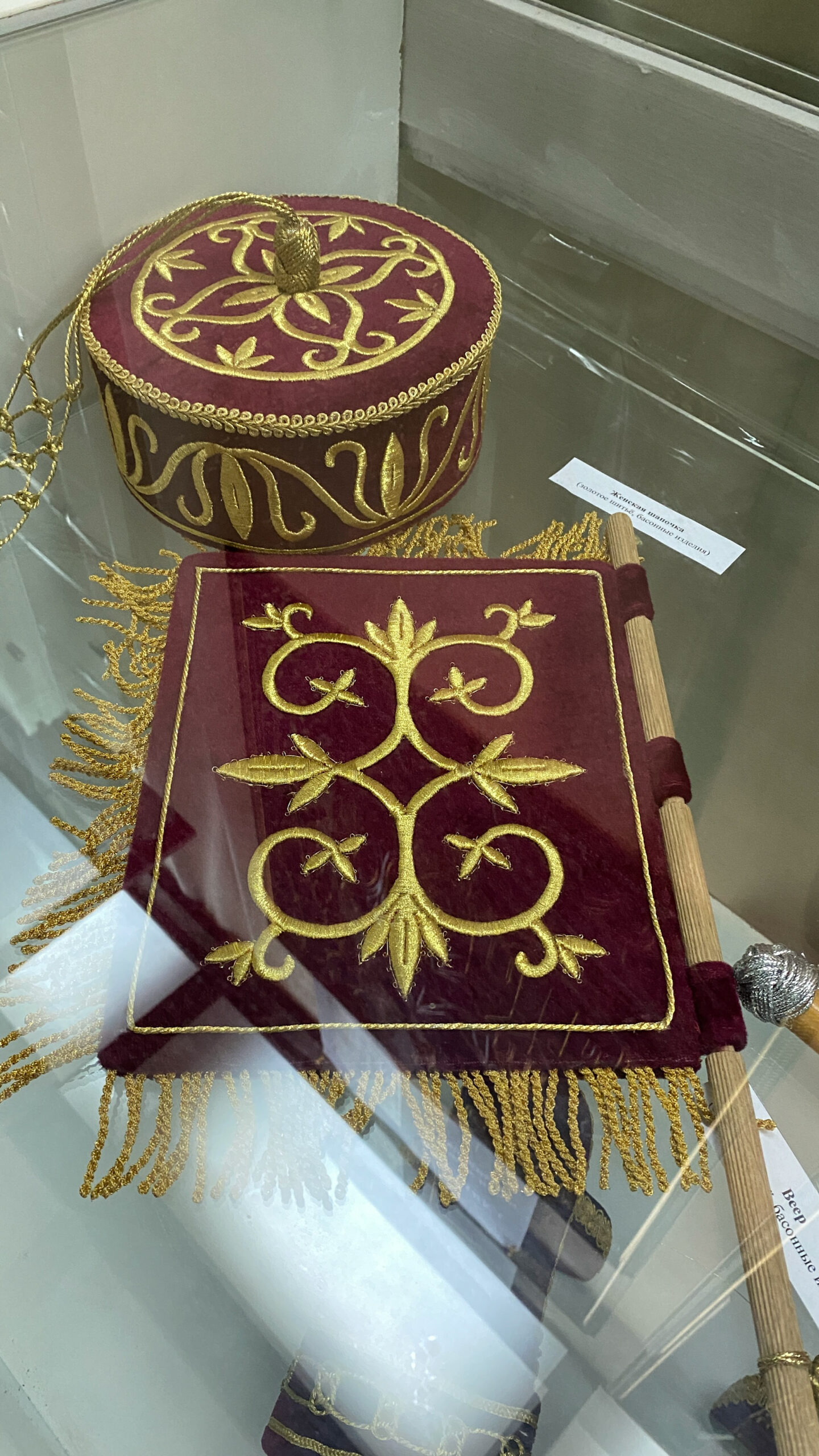
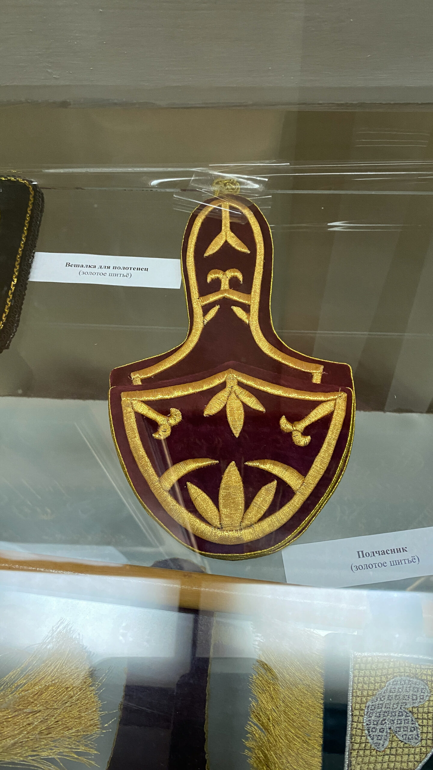
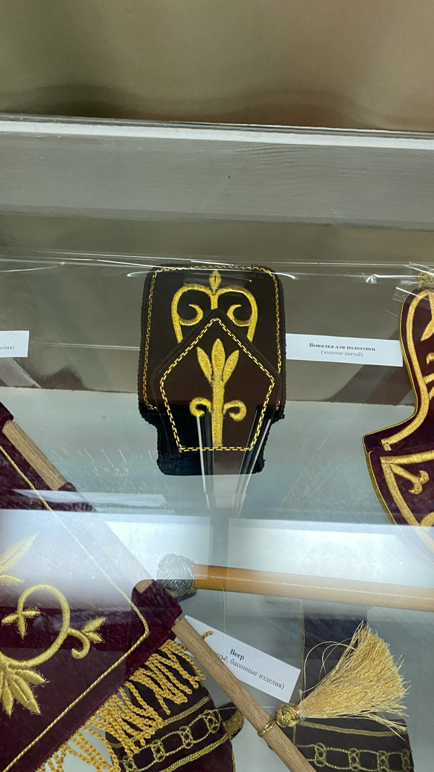
After I moved to Sochi, I met a wonderful family who grow tea. This is a small family business, in which each bush, each tea leaf on the plantation is given special attention. I was lucky to visit this tea plantation and see for myself the quality of tea and the amazing taste of jam. This family not only saved the tea plantation, which was abandoned in the 90s of the twentieth century, but also the traditions of the natives – the Adyghes. The head of the family, the native Adyghe, @adam_chai_ , named the tea after himself and put his whole soul into it. Being impressed by the Adyghe traditional culture, I changed the corporate identity and logo of the tea, bringing its plasticity closer to the historical origins.

Inspired by the traditions of the Adyghe people




Logotype
_
The brand logo is the main element of the company’s corporate identity. The logo must be present on all company media. The primary inscription is preferred, but an abbreviated inscription or symbol can be used if necessary.
Symbol
_
The brand symbol is the main element of the corporate identity. This symbol represents all company activities and is used on all media. The symbol forms the basis of the company logo. It can also be used as an independent element. All character proportions are fixed and cannot be changed. The symbol must only be used from original materials.

Color system
_
The Brand’s color palette consists of several colors: “Adyghe Plum”, white, “Pollen”, black and “Tea Flower”. This page shows the correct numeric values for corporate colors. All content must be created using only these color schemes.

Display font
_
For important headings, decorative elements and individual inscriptions, the font Fedra Serif B Pro Bold is used. It cannot be used in body text, in small sizes, or in anything other than normal style.
Main font
_
The main corporate font of the brand is Roboto. It is used in all advertising layouts to set headlines, subheads and other messages. The font uses six styles: Tin, Light, Regular, Medium, Bold and Black.


Jam


Tea pack


