An accounting company contacted us. She needed to solve several problems: First, to break away from the image of outdated accounting organizations, but at the same time not to become “teenage”. It was necessary to find the perfect balance between modern and accessible style, but without playfulness, because “accounting is a serious matter.” In addition, it was necessary to leave some hint that the accounting department specializes in offshore transactions. It was necessary to wait for it to be casual and artistic.
Tasks
As part of the branding work, it was necessary to perform positioning, create a name, logo, corporate attributes, develop a style and a launch advertising campaign.
We started with positioning. Our topic was managing a business like a ship. We decided to present the business owner as a captain, and the company as a reliable navigator who can be relied on in any storm. This is how the slogan “Others trying, we manage” was born. It differentiates us from other accounting companies and affirms our professional position.
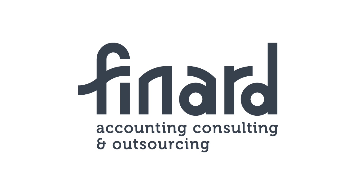
The next step was naming. We spent more than 2 weeks searching for the right word. Most of the searches were around nautical terms. “Guys”, “Lotsia”, “Fordewind” and a hundred other terms we tried on for the future name. But in the end we settled on the banal connection Fin – from “finance” and “ARD” – as a reference to “art”, but in the Dutch manner (still, we couldn’t let go of the marine theme completely). “Finard” was a great name.
Logo design
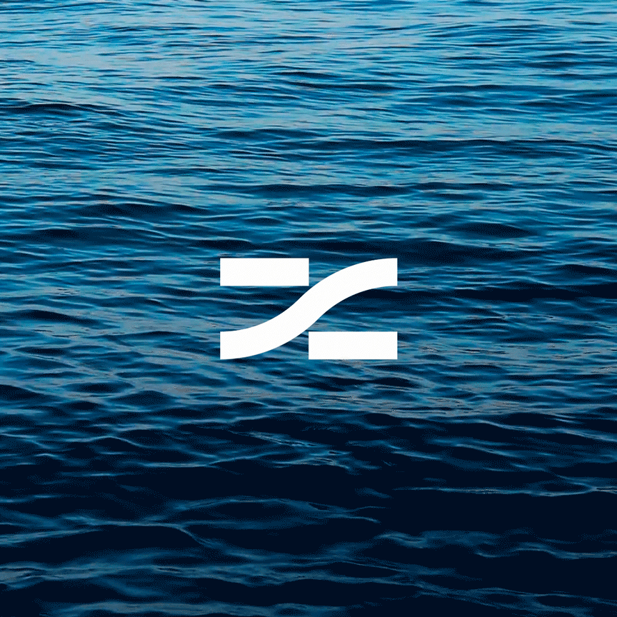
The logo was designed conservatively – we decided to limit ourselves to unique typography with the addition of a sign. The basis of the geometry of the tables is stylized sea waves. We specifically took a “flat” version of the waves, so that even at the graphical level you could feel the confidence and comfort with which our accounting department will guide future clients through the financial waves.
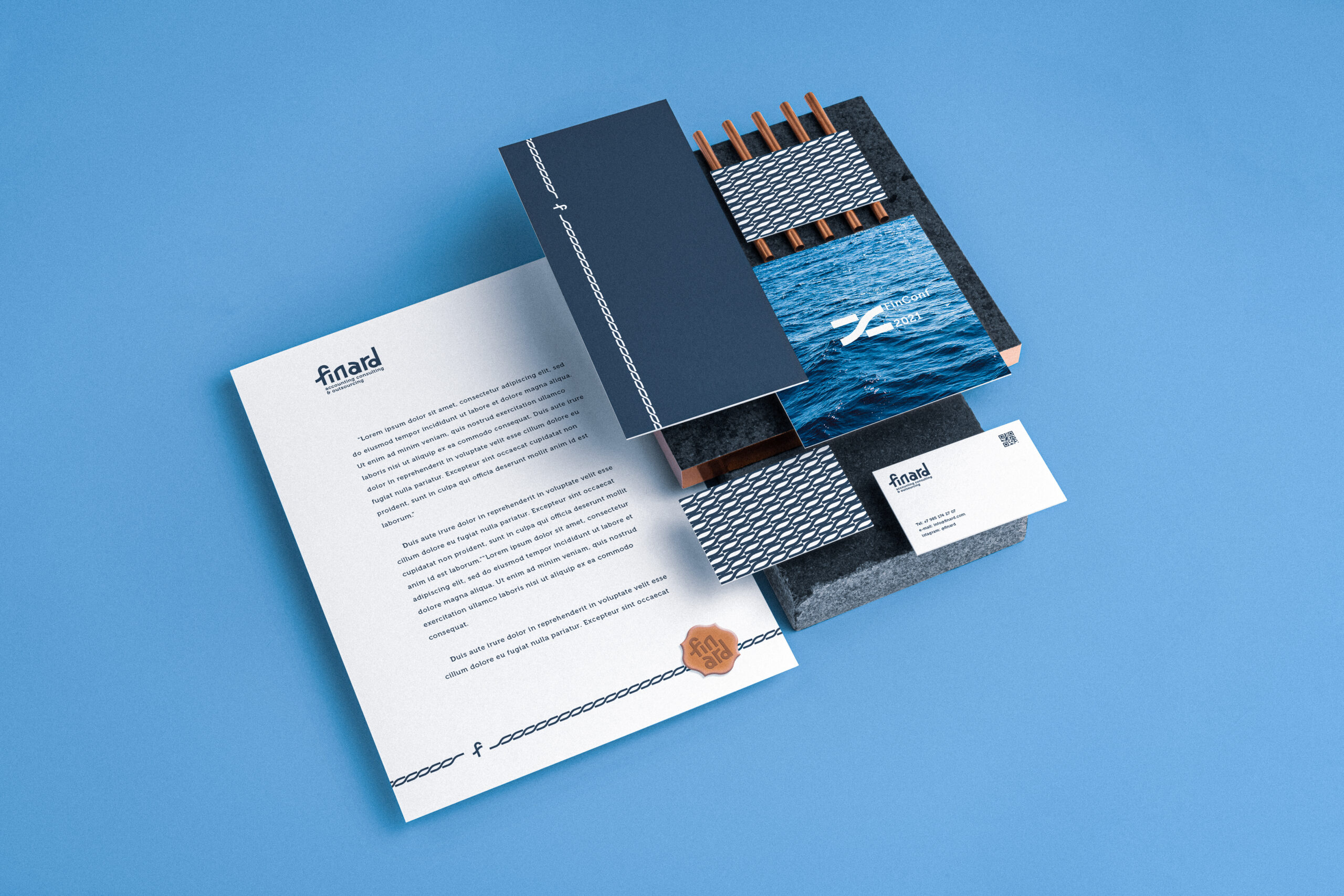
The color scheme is also due to the marine theme. We took calm shades of blue and cyan and complemented them with copper color, creating a full-fledged color space.
Branded borders and patterns became the most important part of the style. They perfectly complement the style, look good on documentation, and are great for any topic. In addition, their original graphics work great to create brand recognition even where logo placement is inappropriate or technically difficult.
After finishing the project we received a lot of positive feedback. According to the customer, his clients were delighted with the new style and were happy to recommend Finard to their friends after the launch. Thus, only due to rebranding, both the customer base and loyalty increased.