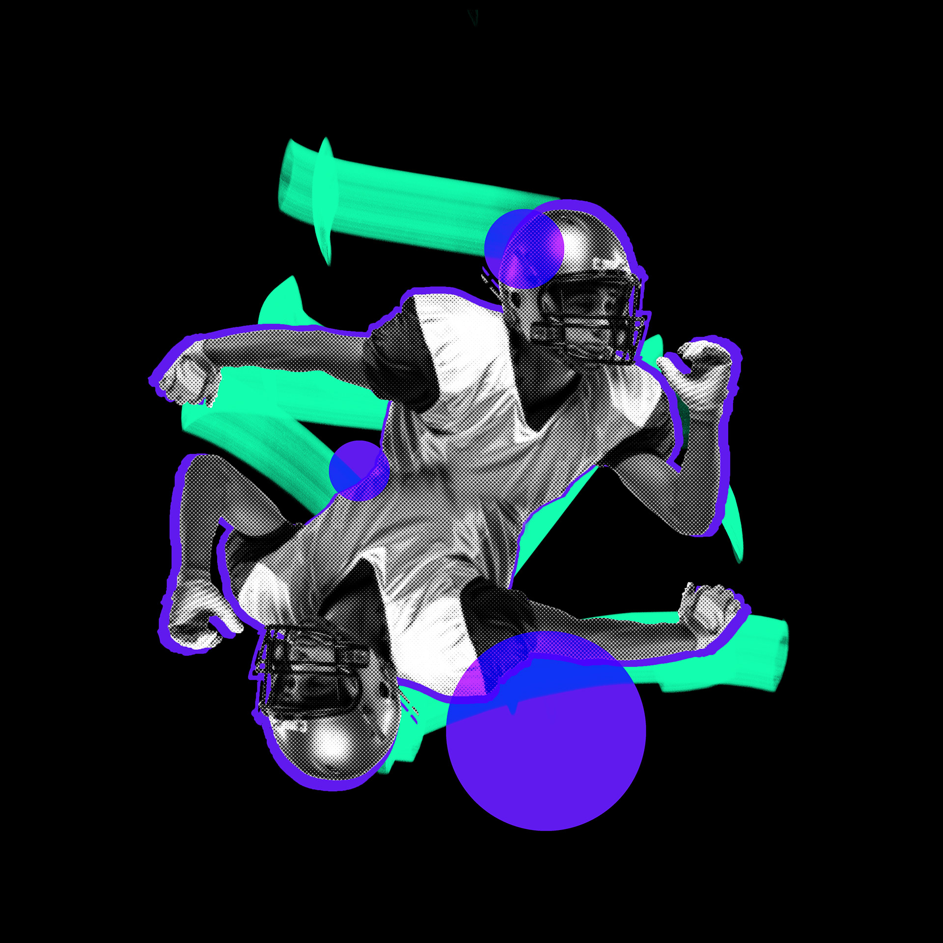
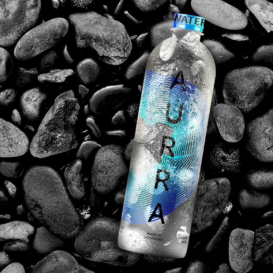
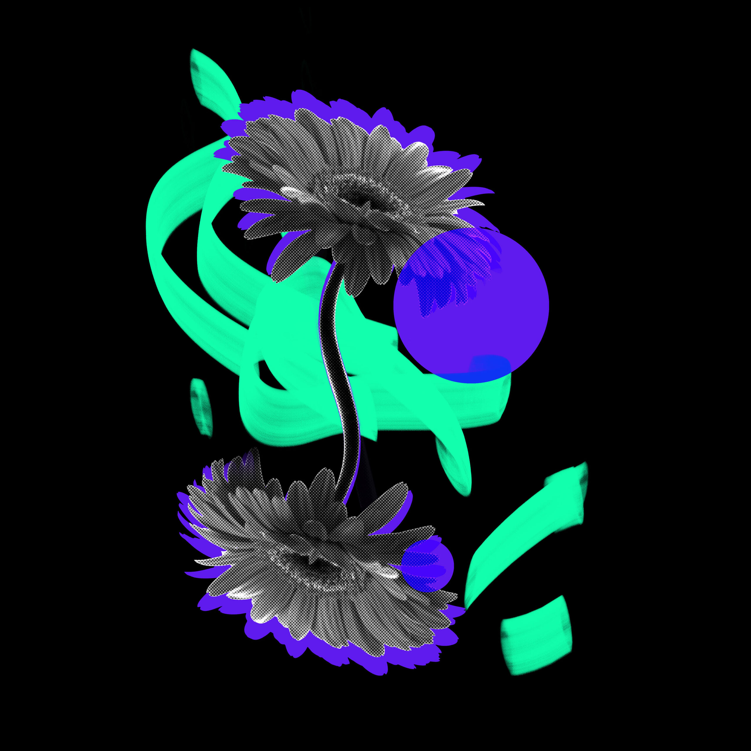
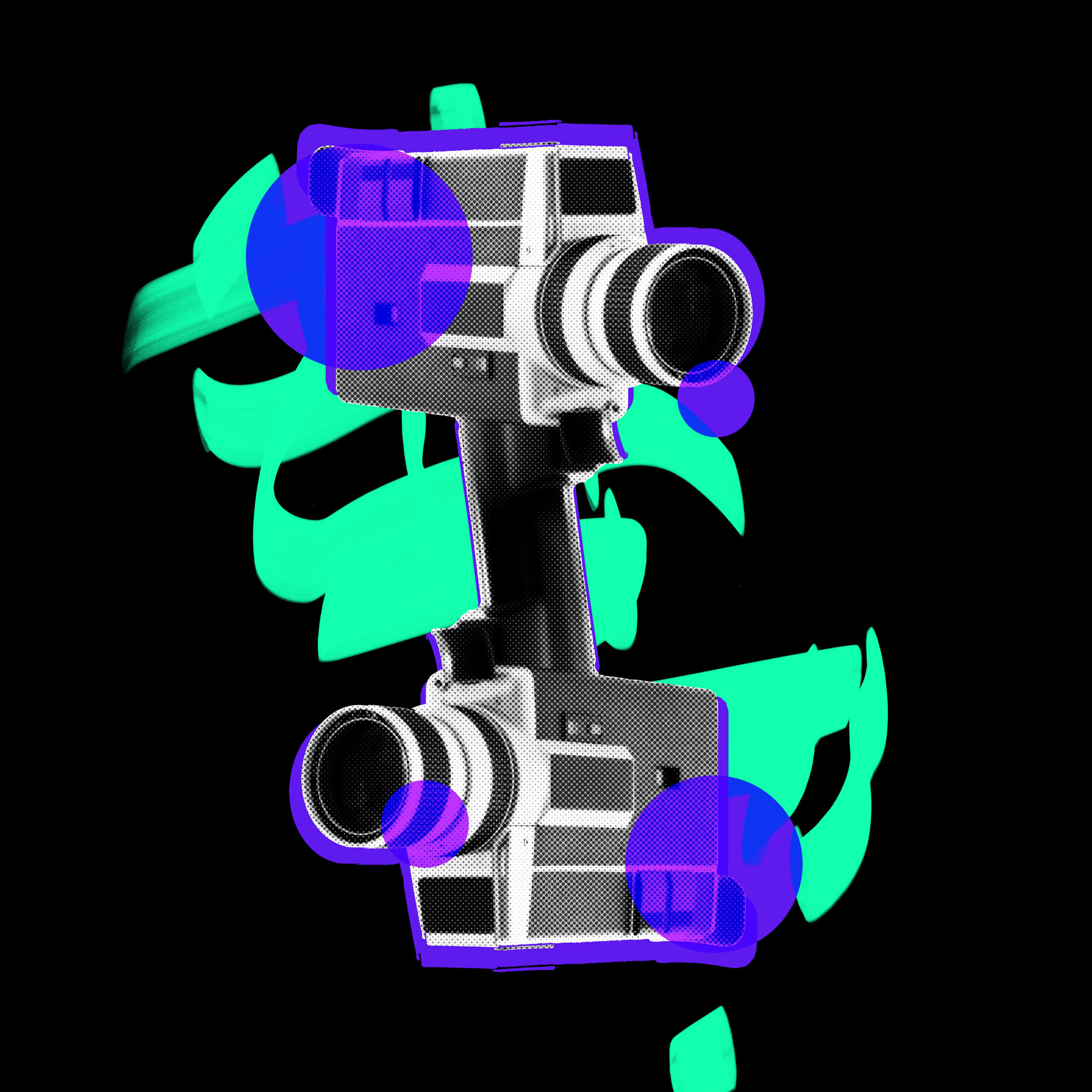
00%
Loading...

Bg int.

keyboard_arrow_down
Boomerang Group are my longtime partners and clients. The company is entering the international market, and needed to restart the brand. The name has changed – the old “Boomerang Group” has changed to “BG INT”. The focus of activities has also changed, now they are focused not on PR, but on SMM marketing. All these changes had to be reflected in the style.
 
BUT one thing has remained unchanged – the philosophy of the company, which implies the effect of a boomerang – “what you sow, you will reap” Philosophy, which speaks of return, karma. This philosophy gave rise to the idea of ​​a sign that would work the same even if it was turned upside down.
 
The name bg – contributed to the implementation of this idea. Immediately there was a sign that is not only easy to read no matter how you turn it over, but also remains a symbol of a boomerang.

The versatility of the symbol made it possible to create more than 40 variants of the logo, which, despite its incredible ability to change, remains recognizable. Such a dynamic logo was supposed to be paired with a corporate identity. It’s done by original illustrations, which, like the logo, work despite the fact that you turn them 180 degrees.

 
The illustrations combine a photo edited in the style of an old newspaper, as a reference to the roots of the campaign that started with PR, and bright dynamic touches. Green color symbolizes freshness, originality of approach. Violet – the wisdom and balance of solutions that BG int offer their clients.

Artwork

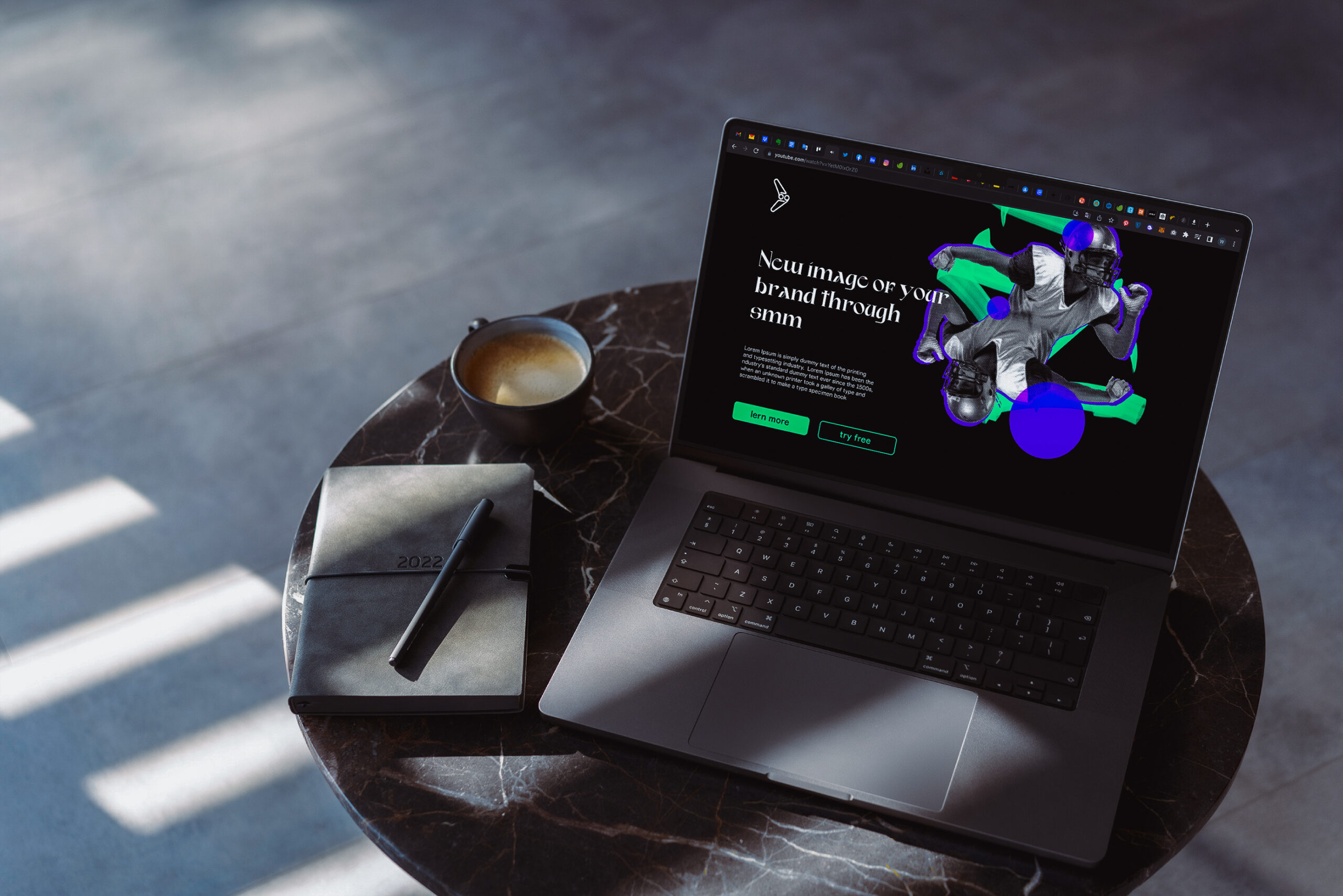
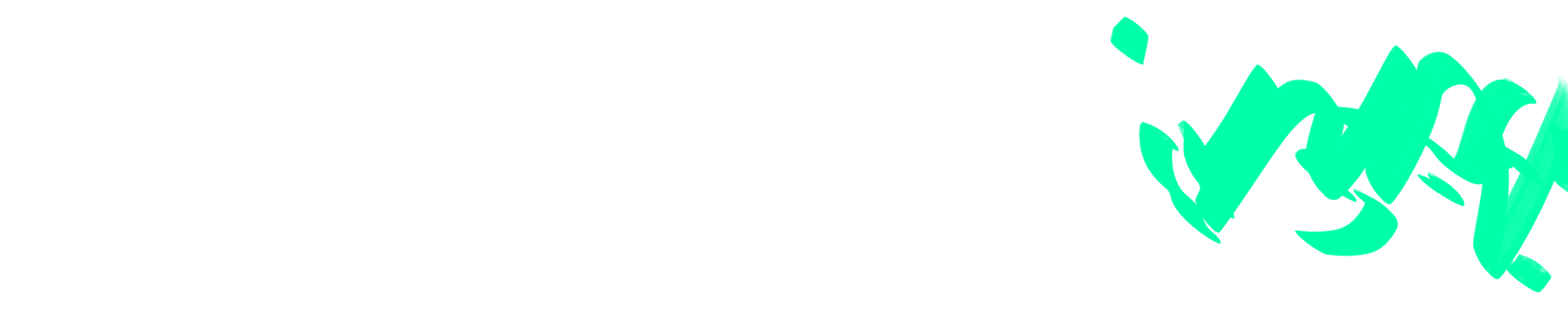
Artwork for the Boomerang Group style can be rotated 180 degrees without losing the character, just like the logo. As part of the work on the style, a universal template was made, which allows you to quickly create new similar art.

SMM

at work