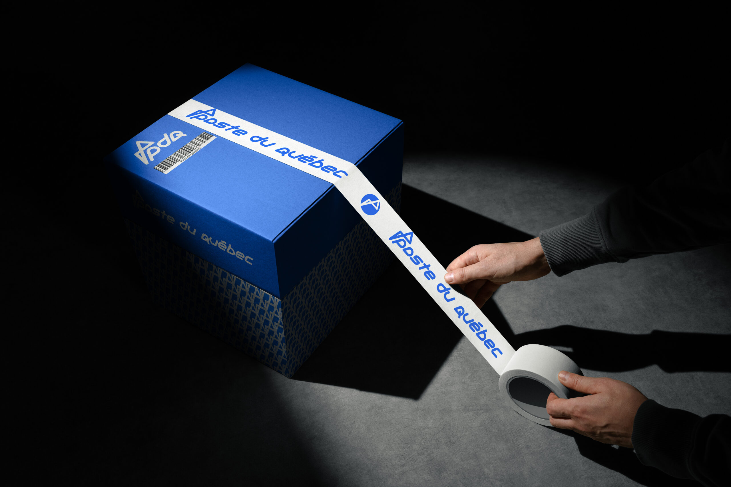
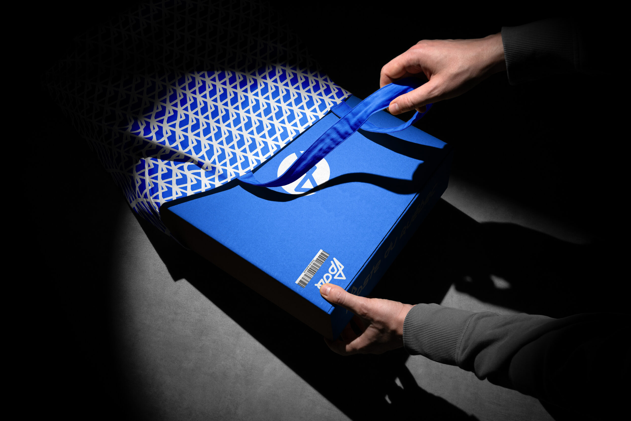
As innovative as the decision to develop the Post Du Québec service is, so is the brand. A unique lettering font has been developed especially for the Post Du Québec brand. The sign itself is a minimalist figure. However, its uniqueness lies in the fact that it is a 3d model. Looking at it from different angles, we get different geometry, symbolizing the different values of the company: the flag as a symbol of leadership, the heart as a symbol of careful customer service, the infinity sign as a symbol of uncompromising quality, the arrow as a symbol of speed. The combination of blue and white is traditional for Quebec and emphasizes the national character of the brand. The versatility of the identity makes it easy to brand various media, while maintaining brand recognition and uniqueness.